
show me

a case study:
sabre airline solutions - redux
The website for Sabre Airline Solutions, the world's largest privider of software and services to airlines had been stagnant for years. Using lesons learned from previous projects, we started from the groud up, recreating the site to accurately reflect the industry leading company and the needs of its users.

initial sketches
After meeting with stakeholders to draft goals and requirements, I used that data to create a large set of initial sketches. I then shopped these sketches around internally to help narrow down the concepts to the ones that would be fleshed out in the sketchboard. Sketches work great for initail concepts as they're quick to make and easy to change.
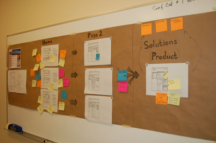
using sketchboards to get feedback
Feedback is most useful early in the process, so after fleshing out sketches of alternate versions of the site, I created a sketchboard and brought in each stakeholder to get their feedback. The technique was well received and solicited great ideas, thoughts and concerns from subject matter experts. I then used these results to create the wireframe for usability testing.
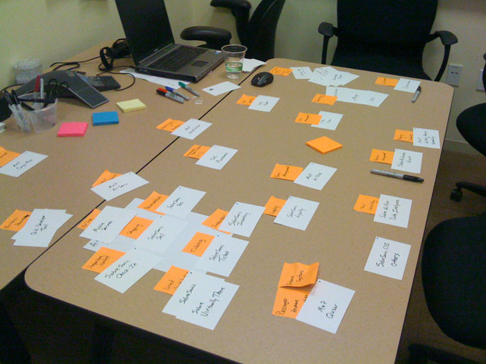
product cardsort
The night before the usability testing began, we realized that we could get ahead of the game by getting user feedback on categories for products. So we created groups for the 100+ products using the language and terms of our users and input from our subject matter experts.
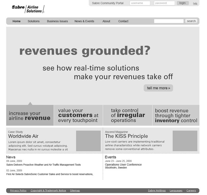
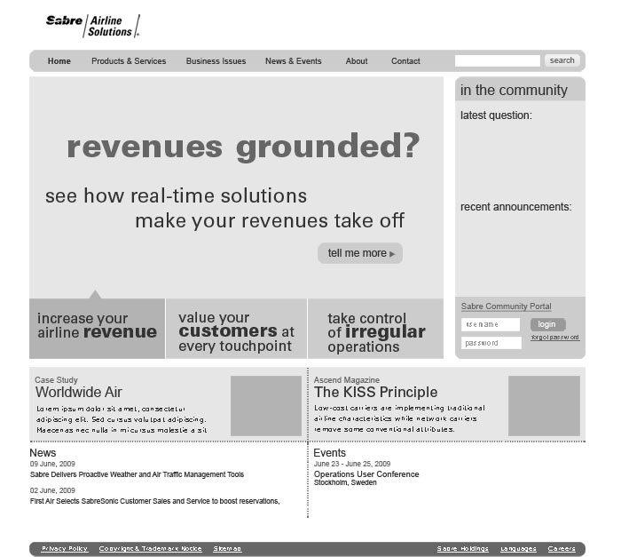
graybox wireframe prototypes
Using the date from the sketchboard sessions, I created a series of clickable wireframes for a comparative usability test. The set included two alternate versions of the homepage and secondary page along with other high traffic landing pages and a sample product page.
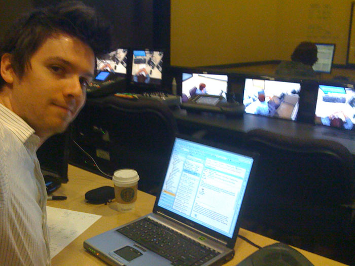
international usability testing
There is no subsitute for watching real users use your website and listening to what they say. For this test, we selected a representative sample of personnel from airlines around the world. The odd hours required for testing with users in Asia was worth it for the valueable feedback we recieved. The results made it clear that focusing on user problems we can help solve resonated with our audience.
selling the community
With almost an even mix of new and current customers visitng the site, we still wanted to see if we could reach out to exiting customers more. Then we recalled the buzz surrounding the new customer community that we'd just launched, and we realized how great it would be to highlight real time content from the community. This not only would speek to existing customers, but sell new customers on becoming part of the largest airline only community.
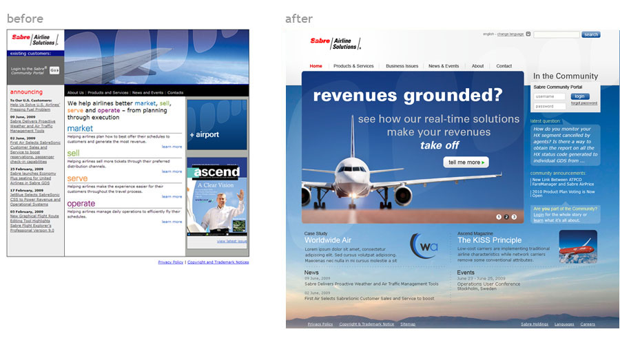
before & after
We were able to take many lessons learned in the Sabre Travel Network redesign to help speed this process along, but the unique audience, and highly specialized products provided a new challenge to overcome. The new design clearly sets off the brand as the leader of the industry. It's user-centric design and content sharpens the marketing and sales focus of the site, reaching out to existing and new customers alike.