- sabre airline solutions
- sabre travel network
- the source
show me

a case study:
rebuilding a site from the ground up
The website for Sabre Travel Network, one of the largest travel data providers in the world, was in desperate need of attention. We started from scratch, to completely rethink the website and make it the centerpiece of marketing communications that it should be.
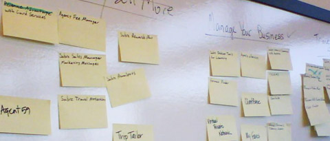
get it together
We began by talking to the experts in the business, people who know the products and the customers better than anyone else. We started from scratch figuring out what content we had, and how we should organize it from the perspective of our customers. We later tested these ideas with actual users. Here we've taken over a conference room for a large cardsort with our product managers.
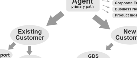
go with the flow
One of the improvements from the old site was that we wanted to create clear paths for our users to follow. While the business has very large and complex user groups, each needed it's own set of process flows to quickly and easily provide access to the most commonly needed information while still providing ease of exploration.
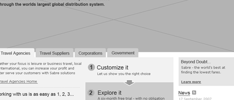
iterative testing
After our initial planning we created graybox wireframes for formative usability testing. We recruited a representative sample of actual users and had the option to modify the wireframes between each test. While it was a lot of work, by the end we weren't making many changes anymore and the result was a very solid, usable set of wireframes. homepage 1, homepage 2, homepage 3.
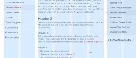
living on the grid
It's good to grid based design coming into favor online. We created a 8 column grid that would provide structure, but still some flexibility as the framework for the site. We then created 1, 2 and 3 column layouts with variations of each as well as standard design elements that could be reused throughout the site for consistency.

design is the details
With the clean aesthetic of the new site, the design details become even more important. In a design like this, it is attention to detail that separates a good design from a great design. While none of the details in themselves should draw too much attention, it is how the work together as a whole that creates the visual experience. And it is the result, the resulting reaction and feeling that the visuals inspire in the user that matters. This feeling helps shape the user experience.
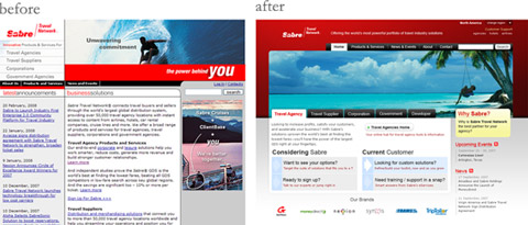
before & after
We had a lot to do on this site. New or rethought: strategy, information architecture, page layout, content management system, visual design, process flows, multimedia, sign-up process, form design, increased usability, use of standards based design principles, increased accessibility, enhanced organic search results, new statistic and tracking capabilities, new automated content update tools, distributed site management, integration of all international sites and multiple languages, and much more.

